

YOUR CART IS CURRENTLY EMPTY
Exhibition stand graphics: the three-second rule and more
Published
Quick answer
Design stand graphics for someone walking past, not someone standing still. Put your logo and one short message high on the back wall, where people can see them over the crowd, and keep that message to about six words. Size the letters for the distance they will be read from, use strong light-dark contrast, and save product detail for eye level, where visitors who stop can read it.
The three-second rule explained
The three-second rule is a rule of thumb used in display design: a visitor walking down the aisle gives your stand a glance of about three seconds, so the graphics have to say who you are and what you offer in that time. It is a working rule, not a measured standard.
A useful published figure comes from road signs. The United States Sign Council's Best Practice Standards for On-Premise Signs (2018) say signs of "four to eight words in simple typography can be comfortably read and comprehended in approximately four seconds", which it sets at half a second per word. On that rate, a three-second glance covers about six words (3 ÷ 0.5 = 6). Drivers aren't exhibition visitors, so treat that as a guide, not a rule. The point holds: short messages in plain type get read; paragraphs on a back wall don't.
A practical test: show the main wall artwork to a colleague for three seconds, then ask what the company does. If they can't say, the message is too long or too small.
Hierarchy: logo, message, proof
Stand graphics work in three layers, each read from a different distance.
- Logo. Who you are. Large, high, and visible from every approach to the stand.
- Message. What you do or offer, in about six words. One message per stand, not one per wall.
- Proof. Product photos, short benefit lines, case examples, a QR code. This is read by people who have already stopped, so it can be smaller and sit lower.
Everything else, such as specifications, price lists and long explanations, belongs on a screen, a brochure, a linked page or with your staff.
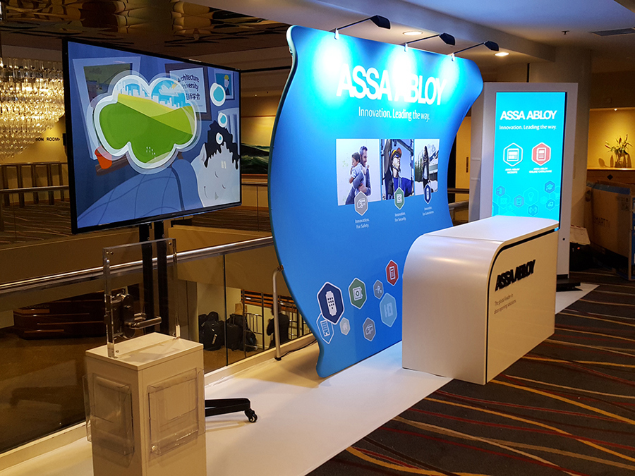
On a curved fabric wall like this one, the logo and tagline sit at the top under the lights, three photos with short captions sit in the middle, and the icons sit near the floor. Each layer is smaller and lower than the one before.
Height: what sits above the crowd line
In a busy aisle, the bottom half of your wall disappears behind people. The Australian Bureau of Statistics reports that in 2011-12 the average Australian adult man was 175.6cm tall and the average woman 161.8cm. Graphics below head height are hidden as soon as people stand in front of them.
- Top band: logo and message. Keep them above head height so they can be seen over visitors' heads from across the aisle. Our Graphics 2 Go shell scheme wall graphics are made 2.35m high as standard to suit 2.4m high shell scheme walls (some shows use 2.5m walls, so check your exhibitor manual), which leaves room for a logo band well above head height.
- Eye level: proof. Product images and short benefit lines for people standing on the stand.
- Lower band: background only. Counters, plinths, stock and visitors hide this zone, so keep important copy out of it.
Check what sits in front of each wall before you finalise artwork. A counter in front of the back wall hides whatever is printed behind it.
Text size by viewing distance
The USSC publishes a "legibility index": the distance in feet at which each inch of capital-letter height can be read. Its average is 30 feet per inch. For highly congested places, such as streets with heavy pedestrian traffic, it lowers the figure to 20 feet per inch, and it adds 15% to letter height when text is set in all capitals. Converted to metric, that gives about 2.8mm of capital height per metre of distance on the average figure, and about 4.2mm per metre on the busy figure.
| Viewing distance | Average (index 30) | Busy setting (index 20) | All capitals, busy setting |
|---|---|---|---|
| 2m (across a counter) | 6mm | 9mm | 10mm |
| 5m (edge of the stand) | 14mm | 21mm | 24mm |
| 10m (across the aisle) | 28mm | 42mm | 48mm |
| 20m (down the aisle) | 56mm | 84mm | 96mm |
These are the smallest capital heights the index says can be read, rounded up to the next millimetre, and they come from studies of drivers reading road signs. A show hall is busy, so start from the busy column. A message read in a three-second glance should be well above these minimums. On our custom stands, we design the main graphics to read from ten metres away.
Colour and contrast
Legibility depends on light-dark contrast more than on colour. The W3C's Web Content Accessibility Guidelines (WCAG 2.2, Recommendation of 12 December 2024) ask for a contrast ratio of at least 4.5:1 between text and its background, and at least 3:1 for large-scale text. It is written for screens, but it is a useful check for printed walls too: put your text and background colours through any contrast checker before artwork is approved.
- Keep text off busy photos. Put it on a plain area of the image or on a solid panel.
- Watch the hall lighting. Gloss finishes reflect overhead lights back at visitors. Dye-sublimated fabric has a low-glare finish, and matt finishes cut glare on vinyl. Our guide to fabric vs vinyl wall graphics compares the materials.
- Match brand colours on purpose. Give us the PMS reference when you order, and order a printed proof where the colour matters.
For how colour shapes the way people feel about your stand, see why colour matters on an exhibition stand.
Common graphic mistakes
- Too many messages. Three products, three taglines and a mission statement across one back wall. Pick one.
- The logo at waist height. It ends up behind the counter or behind visitors.
- Brochure copy on the wall. Paragraphs nobody stops to read. Move them to a screen, a handout or a linked page.
- Thin or decorative type. Light weights and script fonts lose legibility at distance. Use a clear, solid sans serif for the message.
- Key text across a join. Our folding laminated wall panels come in 1m wide sections, and fabric edges sit in the frame. Keep logos and words well inside the trim and away from joins; the product template shows where they fall.
- Low-resolution images. For best results, supply images at 150 ppi at full size; we can't accept anything under 75 ppi. Counter fronts are seen at arm's length, so aim above the minimum there.
- No test at full size. Print a section at full scale, or check the artwork on screen at 100%, and view it from where visitors will stand.
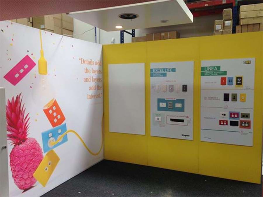
Before you send files, check them against our artwork specifications: bleed, resolution, colour mode and templates.
Next step
Brief our graphic and 3D design team to lay out your stand graphics. If you're supplying your own artwork, our artwork preflighting service ($45 ex-GST per job) has designers who know our templates check your files and send digital proofs back for approval. Call 1300 240 250 or use the enquiry form on any product page.