

YOUR CART IS CURRENTLY EMPTY
RGB vs CMYK: why brand colours shift on printed displays
Published
Quick answer
Screens make colour by emitting red, green and blue light (RGB). Print makes colour with cyan, magenta, yellow and black inks (CMYK) that absorb light, and that ink can't reproduce every colour a screen shows. To keep brand colours on target, supply artwork in CMYK using the values in your brand guidelines, tell us at order which colours are critical, give a Pantone (PMS) reference, and approve a proof before production.
RGB vs CMYK in plain English
RGB is how monitors, phones and screens show colour. They mix red, green and blue light, and full-strength red, green and blue together make white. Adobe calls this an additive colour model.
CMYK is how printing presses and wide-format printers make colour. Cyan, magenta and yellow inks each absorb part of the light that hits them, and black (K) is added for depth in the shadows. Adobe calls this a subtractive model and the method four-colour process printing.
The two systems describe colour in different ways. Adobe's own example is a bright red: on screen it might be R246 G20 B50, while in print it might be 2% cyan, 93% magenta, 90% yellow and 0% black. Same red, two different sets of numbers.
Why colours look different when printed
Every device can only produce a certain range of colours, known as its gamut. A monitor's RGB gamut and a printer's CMYK gamut overlap, but they are not the same. As Adobe puts it, some colours visible on a monitor may not be reproducible by a printer. Those colours are "out of gamut".
An out-of-gamut colour has to be changed to one the inks can make, so it will not print exactly as it looks on screen. If a colour in your palette looks especially vivid on screen, check it on a printed proof first.
Your screen can also mislead you. Adobe notes that the exact range of RGB colours varies by application and display device, and that colour shifts can come from manufacturing differences between monitors or a monitor's age. Two people approving the same file on two laptops may be looking at two different colours.
Material and lighting change colour too
The CMYK range itself depends on the ink and the surface. Adobe describes every CMYK working space as "based on actual ink and paper combinations", and gives the example that newsprint reproduces a smaller gamut than magazine-quality paper.
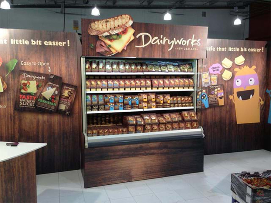
For display graphics the same logic applies across fabric, vinyl, board and other media. Our design team takes this into account when designing a stand, because some colours are hard to replicate exactly across different materials, especially when one stand mixes vinyl, wood and aluminium. Lighting and surroundings matter as well. Adobe points out that a room's colour affects how both screen and printed colour are seen, so a colour judged in a sunlit office or next to a strongly coloured wall can read differently on the venue floor.
This page covers the screen-to-print step. If your colour has to hold on fabric, vinyl and backlit panels at the same time, tell us the materials at briefing so we can plan the match for each one.
Working from brand guidelines: RGB, HEX, CMYK and Pantone values
Most brand guidelines list a colour several ways. Each value has a job.
| Value | What it describes | Use it for printed display graphics? |
|---|---|---|
| RGB | Screen colour, made with light | No. Use for digital screens and web only |
| HEX | The same screen colour written as a web code | No. Use for websites and email |
| CMYK | A mix of four process inks | Yes. This is the value your artwork should use |
| Pantone (PMS) | A named spot colour from the Pantone system | Yes, as the target reference for colour-critical jobs |
Three rules save most colour problems:
- Use the guideline's CMYK values, not an automatic conversion. Your brand team chose those values deliberately. Converting the RGB or HEX value in software can give a different mix.
- Convert spot colours before you send the file. Our artwork specifications ask for all artwork in CMYK mode, with ordinary spot colours converted to CMYK, except an agreed White ink layer and non-printing dielines. Spot colours left in the file are converted during printing, which gives unreliable results. Our how-to guide shows how to convert spot colours to CMYK in Illustrator.
- Keep the Pantone reference alongside the CMYK. Pantone publishes CMYK equivalents for its spot colours, but describes them as the "closest industry-standard CMYK matches". Treat the CMYK version as a close match, not an identical one, and keep the Pantone as the target.
How to colour match brand colours: references and proofs
When a colour must match, give the print team something to match to, then check the result before the full run.
- Flag critical colours at order. Our artwork specifications ask you to tell us at the time of your order and to provide a PMS colour reference. We then create a four-colour process mix to match that reference as closely as possible.
- Choose the right proof.
| Proof | What it shows | How to get it |
|---|---|---|
| Digital proof | Layout, copy and colour placement on screen | On request; ask your salesperson when ordering |
| Printed A3 proof | A physical print you can hold against your reference | On request, $45 each |
- Approve under neutral light, then under real conditions. Compare the proof with your Pantone swatch or an approved printed sample, away from coloured walls and direct sunlight. Adobe recommends neutral grey surroundings for judging colour, and viewing proofs in the conditions your audience will see them in. Even an on-screen proof is only as reliable as the monitor, its colour profiles and the room lighting.
- Record what you approved. Keep the approved CMYK values and the proof with the job, so a reprint or a second stand next year starts from the same reference.
A digital proof is useful for checking that the right values are in the right places, but it is still a screen. Book a printed proof when the colour carries the brand. If the final graphic is on fabric or another special material, ask at order what the A3 proof will be printed on, so you know what you are comparing.
What to tell your printer when colour is critical
Send this with your artwork and you remove most of the guesswork:
- The colours that matter, named, with their Pantone references and the CMYK values from your brand guidelines.
- Vector logos in their current brand colours, so the logo colour is set by the file rather than redrawn.
- A physical reference if you have one: a Pantone swatch, a previous print you were happy with, or product packaging.
- The material and setting: fabric wall, vinyl panel, rigid board or a mix, and whether the graphic will be indoors under venue lighting.
- What else it must match: an existing stand, retail fixtures or printed collateral that will sit beside it.
- Print-ready files that follow our specifications. We prefer high-resolution PDFs, at 100% or proportional size with bleed included. A rich black, if you need one, is set to C50 M50 Y50 K100.
Our wide-format and dye-sublimation fabric printing is managed in house, so our own print team controls colour and finish from start to finish. Read more about our printing and production, and for how colour choice shapes the stand itself, see colour in exhibition stand design.
Frequently asked questions
Should I send my artwork in RGB or CMYK? CMYK. Our artwork specifications ask for all print artwork in CMYK mode, with ordinary spot colours converted, except agreed White ink and dielines.
Can you match our Pantone colour exactly? We create a four-colour process mix to match your PMS reference as closely as possible. Even Pantone lists its CMYK equivalents as the closest matches, so request a printed proof if the colour is critical.
Why does my proof look different from my screen? Your screen shows colour in light (RGB) and the proof shows it in ink (CMYK). Judge colour from the printed proof against a physical reference, not from the monitor.
Next step
Send your artwork with your brand guidelines, name the critical colours and their Pantone references, and ask for a printed proof. To see the graphics we produce for stands, browse our exhibition graphics range, or call 1300 240 250.