

YOUR CART IS CURRENTLY EMPTY
QR code size on banners and displays: distance and testing
Published
Quick answer
Size a QR code by how far away people will scan it from. One published rule of thumb makes the code at least one tenth of the scanning distance: 10cm wide for a scan from 1m, 20cm for 2m. Aim for at least 2cm even up close, keep a clear margin of four modules around the code, print it dark on light, and test it on a printed proof before anything goes to production.
QR code size by scanning distance
The rule of thumb comes from the usability research firm Nielsen Norman Group. Its 13 QR-Code Usability Guidelines (9 February 2024) advise a minimum of 2cm x 2cm, and say that "for every 10cm of distance to the code, add an extra 1cm to the length and width of the code". It also says to make codes bigger where they will be scanned in dim light.
| Where people scan from | Typical display | Minimum code width |
|---|---|---|
| 30cm | Counter-top card, handheld flyer | 3cm |
| 50cm | Counter front, plinth top | 5cm |
| 1m | Pull-up banner from in front | 10cm |
| 2m | Banner or wall across a walkway | 20cm |
| 3m | Back wall of a stand from the aisle | 30cm |
These widths are for the code itself. The clear margin around it, explained below, is extra. Treat them as minimums: if you're unsure of the distance, go up a row.
Why a short link scans better
Distance isn't the only factor. A QR code is a grid of small squares called modules. DENSO WAVE, which developed the QR code, explains that the grid runs from 21 x 21 modules (Version 1) to 177 x 177 (Version 40), and that more data means more modules. Squeeze more modules into the same width and each one gets smaller and harder to read. Use a short link, so the code needs fewer modules and reads more reliably at any size.
The quiet zone: clear space around the code
Every QR code needs a clear margin, called the quiet zone, with nothing printed in it. DENSO WAVE says: "QR Code requires a four-module wide margin at all sides of a symbol." The GS1 2D Barcode Colour & Quality Guide (Release 1.0, February 2025) sets the same four modules for QR codes and warns that graphics, colours or other printed elements in that space can make a code harder to read.
A worked example: a code 29 modules wide (DENSO WAVE's Version 3) printed 100mm wide has modules about 3.45mm square (100mm divided by 29). The quiet zone is four modules, so allow at least 14mm of clear space on every side, about 128mm in total. Keep backgrounds, photos, trim lines and panel joins out of that space.
GS1 also publishes much smaller module sizes for QR codes on packaging, but those are for checkout scanners, not a phone scanning a banner, so use the distance table for displays.
Where to put a QR code on a banner, counter or wall
Put the code where people stop, not where they walk past. Nielsen Norman Group suggests assuming people need at least 15 seconds to scan a QR code, from noticing it to tapping the link. That's far longer than the few seconds a passer-by gives a stand or a centre display, as our article on the three-second rule for stand graphics explains.
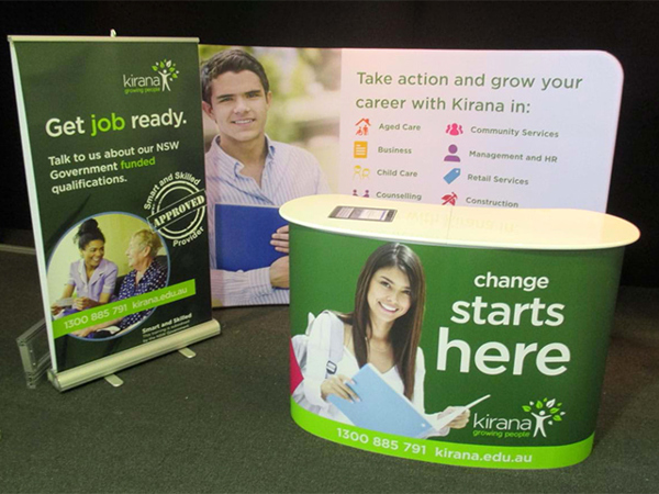
- Counters and plinth tops. People stand still here, so this is often the best spot. Our popup counter has a graphic wrap across the front and both sides, plus an optional header board above, so the code can sit on the face your visitors stand in front of.
- Banners. On a pull-up banner, our banner stands page suggests putting what matters most in the upper two-thirds, so it stays above table height. Put the code within that area and within easy reach of a phone, not at floor level. See our range of banner stands for sizes.
- Next to what it explains. Nielsen Norman Group warns that a code pushed into a corner is less likely to be noticed. Put it beside the line that tells people what they get.
- Face the light, avoid glare. GS1 advises against printing codes on glossy or reflective surfaces, because reflections can hide parts of the code. On a glossy panel, use a matt area behind the code.
Contrast, colour and logos
- Dark on light. Nielsen Norman Group says to use a dark code on a light background, because not all scanning technology can read inverted colours. GS1's guide, written mainly for checkout scanners, lists black, dark blue, dark green and dark brown as good colours for the squares on a light background.
- Keep the contrast high. For checkout scanning, GS1 asks for symbol contrast of at least 30%, and recommends about 50% for greater reliability. It gives a yellow code on white as an example of low contrast, so keep pale brand tints for the rest of the artwork.
- Be careful with logos. GS1's guide treats a logo placed over a code as damage: the code only reads because its error correction rebuilds the hidden data. In one example in the guide, a 16mm logo made the code fail at levels L and M, fail marginally at Q and pass only at H. If you must add a logo, keep it small, keep it off the three large corner squares, and test it.
- Choose the error correction level. DENSO WAVE describes four levels that can restore about 7% (L), 15% (M), 25% (Q) or 30% (H) of the data. M is the most common choice, and Q or H suit places where codes may get dirty. Higher levels add modules, so each one gets smaller at the same printed size: make the code a little bigger, and test it.
Give people a reason to scan
A code nobody scans is wasted print. Nielsen Norman Group's guidelines put the reason first: a QR code tells people nothing about where it goes.
- Say what they get. "Scan to book a demo" or "Scan for the full spec sheet" next to the code, as prominent as the code itself.
- Make it worth the scan. A sample, a booking, an entry or content they can't get from the wall.
- Send them to the right page. Link straight to a mobile-friendly page about what's on the display, not your home page.
- Show a short web address too. It helps people who'd rather type, and anyone visiting later on a laptop.
- Plan for later scans. Printed codes keep being scanned after the campaign ends, so point the code at a link you can redirect.
Test the code before you print
- Print the code at 100% of its finished size, or check a printed proof, not just the screen.
- Scan it from the real distance with at least two phones, one iOS and one Android.
- Scan under light like the venue's, and on the finished material if you can.
- Check the quiet zone is clear on the final layout, including bleed and trim.
- Tap through to the landing page on mobile data and check it loads fast and makes sense.
- Place the code in your PDF as vector artwork if you can. If it's an image, follow our artwork specifications: at least 150 ppi at finished size.
- Check every phone number and web address on the proof as well, by dialling and typing them.
If you'd like a second pair of eyes, our optional pre-flighting service costs $45 ex GST per job. Experienced designers check your artwork and send digital proofs back for your approval. Scan-testing the code is still up to you: print it from the proof at full size and scan it before you sign off.
Next step
Need help placing a QR code on a banner, counter or wall? Send us your artwork through the enquiry form, or call 1300 240 250.